Author Topic: Contribution Discussion  (Read 17897 times)

Nikodemus

  • Prospects
  • Veteran
  • *
  • Posts: 1808
    • View Profile
Re: Contribution Discussion
« Reply #75 on: May 20, 2007, 10:46:35 am »
Someone help me!
read your PM x)
Also it is a good idea to always strech your texture as less as possible. I have already idea about it, but i can really do nothing without a model, hopefully you work in blender.


What you can failure tommorow, failure today.


Better click for shiny stylez Help me with images!

Nikodemus

  • Prospects
  • Veteran
  • *
  • Posts: 1808
    • View Profile
Re: Contribution Discussion
« Reply #76 on: May 23, 2007, 10:38:57 am »
Rast: I like it. But it would be boring to alk about thats great about it, so: ;)
- the green moss looks a bit to cheap, but from other side it makes the chest look more interesting. I think its just how it is done, although i don't know if  did it better myself.
- the pattern at the top. Didn't you just use round darkening brush? ;P Doesn't look really good, maybe if you prepared the shape before and making a selection from it you ould the pla with that darkening?
- Isn't the lock texture more detailed than the rest of the chest? It shouldn't be i think. If you make the texture space for it smaler, maybe you will also manage to ralign the rest form better space use n the texture. It is said that te less texture spae is not used, the better, it is partially true, because you always have to make the texture a bit beyond the UV borders, but all the remaning space is single color, and the compression is there to compress it.
I just don't think there is a lot of loss when a lot of texture space is not used. Although minimal, skilled artists should try to avoid it.
-Maybe it s subiective, but i would "clarify" the who texture a bit and then changed contrast/brightness a bit like 7/-1

Bastiq: I wouldn't even hope this will go in game, sorry ;P you have a lot to learn, like smoothing, real texture making, and more efficient use of faces (faces are triangle to take advantage of it, not to turn them into quads, just because it is simpler ;))
« Last Edit: May 23, 2007, 10:46:01 am by Nikodemus »


What you can failure tommorow, failure today.


Better click for shiny stylez Help me with images!

Baldur

  • Veteran
  • *
  • Posts: 1446
  • Disillusioning since 1989
    • View Profile
    • My Deviant
Re: Contribution Discussion
« Reply #77 on: May 23, 2007, 12:08:57 pm »
Ligh: You might try adding some dark areas which follow the white hairs, like shadows. Fluffy hairs often don't lie on top of each other, they're usually pointing slightly upwards in small tufts, groups of hair.

Hope that might've helped a bit, not completely black but small, discrete shades.

Edit: Looking at it again, not that many shades. I see you've already got some :]
« Last Edit: May 23, 2007, 12:11:15 pm by Baldur »

LigH

  • Forum Legend
  • *
  • Posts: 7096
    • View Profile
Re: Contribution Discussion
« Reply #78 on: May 23, 2007, 12:13:06 pm »
Baldur, the texture itself already has a rather high contrast ... but I don't know by hell why the Blender 3D display shows it all dark and brownish, and the Blender internal raytracer does not display any texture at all.

Gag Harmond
Knight and Ambassador
The Royal House of Purrty

Bastiq

  • Traveller
  • *
  • Posts: 46
    • View Profile
Re: Contribution Discussion
« Reply #79 on: May 23, 2007, 06:23:41 pm »
Bastiq: I wouldn't even hope this will go in game, sorry ;P you have a lot to learn, like smoothing, real texture making, and more efficient use of faces (faces are triangle to take advantage of it, not to turn them into quads, just because it is simpler ;))

Agreed. I'm working on improving it right now. Nothing complex but better looking and fewer faces.

rast

  • Hydlaa Citizen
  • *
  • Posts: 246
    • View Profile
Re: Contribution Discussion
« Reply #80 on: May 23, 2007, 07:41:19 pm »
Thanks for the pointers Nikodemus :)
I'll have a go at some point re-doing some of the texture/uv map. It only really occured to me after i'd posted it that i'd left the strange pattern on top on it, so i'll definately try to get rid of it/improve it.

Edit:
Got a new texture, though i haven't had enough time to do anything major with it:


@LigH
looks great :)

cheers,
rast
« Last Edit: May 23, 2007, 10:19:39 pm by rast »
"You're just jealous because the voices are talking to me and not you...."

Join in:
Klyro city project

ThomPhoenix

  • Testers
  • Forum Addict
  • *
  • Posts: 2678
  • A Phoenix, what'd you expect?
    • View Profile
Re: Contribution Discussion
« Reply #81 on: May 24, 2007, 12:12:58 am »
Bastiq, don't forget to make a proper icon for your Crystal Ring. The current Crystal Ring uses the icon from the Iron Ring. If your contribution doesn't include both a 3d model and an icon, it won't be accepted.

And moderators, forgive my unbelievable daring by posting this message in the contribution thread first. The horror when I realized what I had done!
« Last Edit: May 24, 2007, 12:18:29 am by ThomPhoenix »
We're not evil. We're simply amazing.

Karyuu

  • Forum Legend
  • *
  • Posts: 9341
    • View Profile
Re: Contribution Discussion
« Reply #82 on: May 24, 2007, 12:19:00 am »
I would also give some advice to Bastiq:

First make sure that you are only using one texture sheet - all your textures for one object should be one image, and not separate pieces. Also, don't use flat colors. A texture is a work of art, so treat it the same :) It is not enough to just fill a space with yellow and call it gold, and a grey fill does not a crystal make. You have to go in and create a texture - which is a tactile quality, a feel. You have to know what surface the object would have just by looking at it.

Also, smooth your faces so that the item looks like one continuous object instead of being broken up into polygons as it is now. If you follow these suggestions, you will have a truly beautiful model.
Judge: Are you trying to show contempt for this court, Mr Smith?
Smith: No, My Lord. I am attempting to conceal it.

ThomPhoenix

  • Testers
  • Forum Addict
  • *
  • Posts: 2678
  • A Phoenix, what'd you expect?
    • View Profile
Re: Contribution Discussion
« Reply #83 on: May 24, 2007, 12:21:50 am »
Indeed. Example:

We're not evil. We're simply amazing.

Bastiq

  • Traveller
  • *
  • Posts: 46
    • View Profile
Re: Contribution Discussion
« Reply #84 on: May 24, 2007, 09:15:19 am »
Thanks for all these suggestions. :)
Actually i've been working on a med ring since about 2 hours after i posted that last one, but are having some problems. I hope that i get something that looks good soon. :)

Also there is a icon on that image. Just below the text to the right.
« Last Edit: May 24, 2007, 09:17:00 am by Bastiq »

LigH

  • Forum Legend
  • *
  • Posts: 7096
    • View Profile
Re: Contribution Discussion
« Reply #85 on: May 25, 2007, 08:29:47 am »
Because a good friend asked how I make my icons, I decided to tell you how you could do it e.g. in The GIMP.

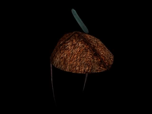
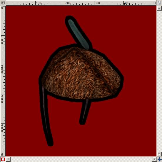
Let's assume you have an image in a good looking resolution, like a 3D render result, preferably on a deep black background.


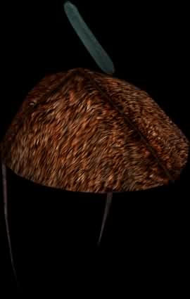
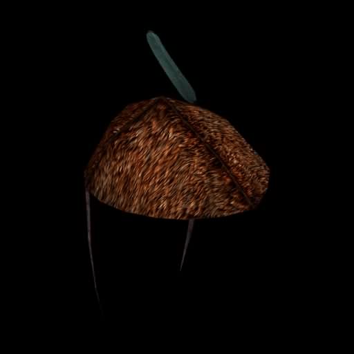
You will want to have it in the center of the icon, therefore I recommend to "exempt" the interesting part (on a unicolor background you could use the "Autocrop Image" function), and - after setting the background color to "black" - change the canvas size afterwards to a square with the length of the longer side plus about 10%. In GIMP, you will have to resize all layers while changing the canvas, and center the image before resizing.

=>


Now, we add the Alpha channel to the image layer!


Then it is time for the "Magic Wand". We will usually select by Composite, with edge smoothing, and a low threshold. We select the blackness around the object of interest ...


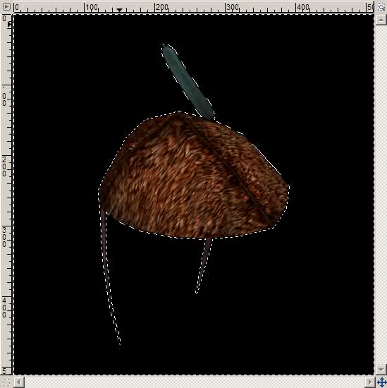
... and then we would want to select not sharply and exactly all blackness around the object, but rather smoothly, blurred -- because we want to get a kind of "black glow".

What if we would blur the selection inwards right now? -- Then we would get a black glow around the object, and also a black glow around the whole image itself. Bad idea.

Instead, let's do a little trick:

- invert the selection (that selects the object only)
- grow the selection smoothly (*)
- invert the selection again

(*) Better image editors may be able to manipulate the selection itself like a layer already.
Quote
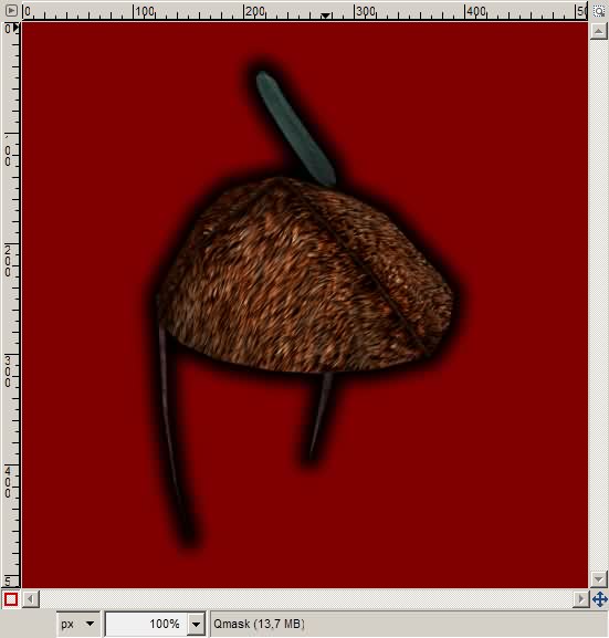
The GIMP 2.3 seems not to provide this feature, so we have to use the "Quick mask" after inverting the selection, and growing it by ~10 pixels. (Menu: Selection - Enable/disable Quick Mask -- or the button in the bottom left corner of the image window.)


In the "Layers, Channels, Paths..." toolbar, switch to the "Layers" tab, and select the Quick Mask. Then apply a Gaussian blur with a radius of 2 times the selection growth amount.


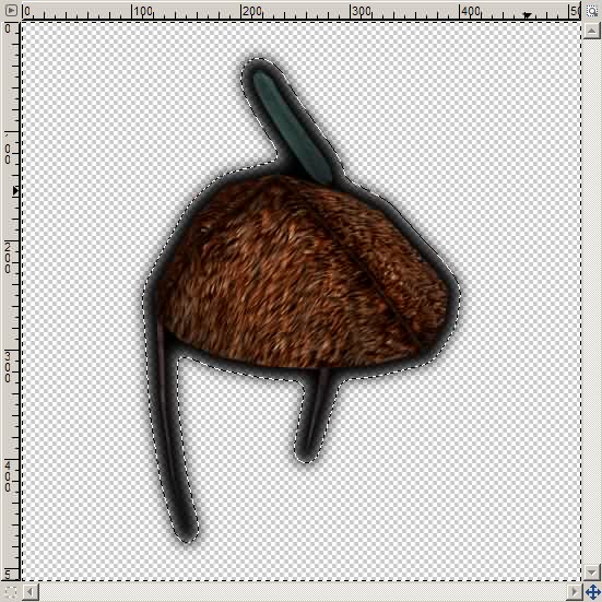
Then we can disable the Quick Mask.


Now we invert the selection back to the outer area, and press the "Delete" key on the keyboard...


Deselect everything, a final scale to 64×64 pixels, save as PNG (in GIMP: do not check "interlacing" - and "save colors from transparency" may not be necessary), and voila: Our icon is available.

« Last Edit: May 25, 2007, 08:33:58 am by LigH »

Gag Harmond
Knight and Ambassador
The Royal House of Purrty

Cherppow

  • Hydlaa Citizen
  • *
  • Posts: 493
    • View Profile
Re: Contribution Discussion
« Reply #86 on: May 25, 2007, 12:53:44 pm »
Hi,

Nice guide LigH, I've never thought that it's better to make the black border shade before resizing. How silly of me. I'm going to be using this. :)

And to add little content to this post:
Good news for Blender modelers who struggle with textures. Drawing static shadows just got easier.

1. Model an object. Here's my test mesh.


2. Assign a new image to it in the UV/Image editor. Then select Render - Bake Render Meshes - Ambient Occlusion, from the User preferences header.


3. The render takes a while, and will draw nice ambient shadows for your texture. Remember to save the resulting image from UV/Image editor.

(don't mind my basic uv-map)


4. Here's a render with the above texture applied.


You still need to make a real texture by hand, but can use the ambient shadow image over it, say with "hard light" mix mode. Try it, and use it if you like. Have funnies. :)
- Cherps

Baldur

  • Veteran
  • *
  • Posts: 1446
  • Disillusioning since 1989
    • View Profile
    • My Deviant
Re: Contribution Discussion
« Reply #87 on: May 26, 2007, 12:30:19 am »
* Baldur goes to download the latest version of Blender

Great guide, Ligh! Though I prefer drawing freehand I consider it a great alternative on those lazy days :)
« Last Edit: May 26, 2007, 12:32:45 am by Baldur »

Nikodemus

  • Prospects
  • Veteran
  • *
  • Posts: 1808
    • View Profile
Re: Contribution Discussion
« Reply #88 on: May 31, 2007, 12:11:39 am »


What ya think?

Any ideas what sealed report should also have?
Since paper is twosided (what a discovery ;D) there should be some letters from one side at least, any ideas what kind and where?
The area of the paper is close to A4 format.
Some other ideas?


What you can failure tommorow, failure today.


Better click for shiny stylez Help me with images!

LigH

  • Forum Legend
  • *
  • Posts: 7096
    • View Profile
Re: Contribution Discussion
« Reply #89 on: May 31, 2007, 08:23:32 am »
A taste of things to come: I'm working on the "Crystal Ring". So far a high-resolution mesh:


I hope to find a way later to reduce the triangle count -- if necessary, and where it doesn't hurt too much.

Gag Harmond
Knight and Ambassador
The Royal House of Purrty